Exploratory Data Analysis
EXPLORATORY DATA ANALYSIS
In this section, we would like to explore the pattern and characteristics of rat inspections through multiple visualization dimensions and analyze the association between inspections and various potential covariates, including climatic, geographical factors.
Time Visualizations
In order to obtain in-depth insights of the rat inspections across time, we used four different levels to analyze.
Overall Rat Inspections Across Time
First, a time series plot was used to illustrate data points at successive intervals of time. From 2012, the number of rat inspections generally presented a increasing trend and reached its peak in 2018. After 2020, it appeared a sharp decrease as the outbreak of COVID-19.
by_date = rat %>%
  group_by(date) %>%
  summarise(Total = n())

time_series = xts(by_date$Total , order.by= by_date$date)

hchart(time_series, name = "Rat Inspections") %>%
  hc_credits(enabled = TRUE, text = "Sources: NYC OpenData", style = list(fontSize = "12px")) %>%
  hc_title(text = "Time Series of NYC Rat Inspections") %>%
  hc_legend(enabled = TRUE)
Rat Inspections by Year
To be more specific, we compared the rat inspections year by year. The number was roughly around 150,000 in 2012-2016. There was a surge of rat inspections in 2017 which had 247,985 cases. After staying at the peak in 2018-2019, the number of inspections rapidly dropped to 71,770 in 2020. Whether this drop was associated with COVID-19 will be analyzed in the following section.
rat %>%
  mutate(inspection_year = as.factor(inspection_year)) %>%
  group_by(inspection_year) %>%
  summarise(n_obs = n()) %>%
  plot_ly(x = ~inspection_year, y = ~n_obs, type = "scatter", mode = "lines+markers") %>%
  layout(xaxis = list(title = "Year"),
         yaxis = list(title = "Count"),
         title = "Number of Rat Inspections by Year")
Rat Inspections by Month
The average number of rat inspections was 13,997. We plotted the number of inspections every months across years and found that rats were more likely to be inspected in spring compared to winter. This might be due to the nicer weather in spring, suitable for rats to wander outside.
rat %>%
  mutate(inspection_month = as.factor(inspection_month)) %>%
  mutate(inspection_month = inspection_month %>%
                       fct_relevel("Jan", "Feb", "Mar","Apr","May", "Jun", "Jul", "Aug", "Sep", "Oct", "Nov", "Dec")) %>%
  group_by(inspection_year, inspection_month) %>%
  summarise(n_obs = n()) %>%
  plot_ly(x = ~inspection_month, y = ~n_obs, type = "box",
          color = ~inspection_month) %>%
  layout(xaxis = list(title = "Month"),
         yaxis = list(title = "Count"),
         title = "Number of Rat Inspections by Month") %>%
  hide_legend()
Rat Inspections Througout a Day
Most rat inspections happened at daytime regardless of the month, concentrated at 9am-12pm. Contradicted with the common sense that rats prefer nightlife, this finding would be corresponding to inspectors’ daily schedule. Additionally, there are a few explanations for observing rat during daylight hours:
- The infestation is large
- The older/sub-dominant rats cannot compete with dominant rats for food during the safer night time period
Inspection
rat_2021 %>%
  mutate(inspection_day = as.factor(inspection_day)) %>%
  mutate(inspection_month = as.factor(inspection_month)) %>%
  mutate(inspection_month = inspection_month %>%
                       fct_relevel("Jan", "Feb", "Mar","Apr","May", "Jun", "Jul", "Aug", "Sep", "Oct", "Nov", "Dec")) %>%
  separate(inspection_time, into = c("hour", "minute", "second")) %>%
  rename(Month = inspection_month) %>%
  group_by(Month, inspection_day, hour) %>%
  summarise(n_obs = n()) %>%
  plot_ly(x = ~hour, y = ~n_obs, type = "scatter",
          color = ~inspection_day,
          frame = ~Month) %>%
  layout(xaxis = list(title = "Time", range = list(0,24), dtick = 3,
                      tickvals = c(0, 3, 6, 9, 12, 15, 18, 21, 24),
                      ticktext = c("12am", "3am", "6am", "9am", "12pm", "3pm", "6pm", "9pm", "12am")),
         yaxis = list(title = "Count"),
         title = "Number of Rat Inspections Throughout a Day in 2021") %>%
  hide_legend()
Observed
rat_2021 %>%
  filter(!result == "Passed") %>%
  mutate(inspection_day = as.factor(inspection_day)) %>%
  mutate(inspection_month = as.factor(inspection_month)) %>%
  mutate(inspection_month = inspection_month %>%
                       fct_relevel("Jan", "Feb", "Mar","Apr","May", "Jun", "Jul", "Aug", "Sep", "Oct", "Nov", "Dec")) %>%
  separate(inspection_time, into = c("hour", "minute", "second")) %>%
  rename(Month = inspection_month) %>%
  group_by(Month, inspection_day, hour) %>%
  summarise(n_obs = n()) %>%
  plot_ly(x = ~hour, y = ~n_obs, type = "scatter",
          color = ~inspection_day,
          frame = ~Month) %>%
  layout(xaxis = list(title = "Time", range = list(0,24), dtick = 3,
                      tickvals = c(0, 3, 6, 9, 12, 15, 18, 21, 24),
                      ticktext = c("12am", "3am", "6am", "9am", "12pm", "3pm", "6pm", "9pm", "12am")),
         yaxis = list(title = "Count"),
         title = "Number of Observed Rats Throughout a Day in 2021") %>%
  hide_legend()
Borough Visualizations
We explored the demographic characteristics of the rat inspections to find whether there exists some potential spatial patterns or not.
Overall Rat Inspections by Borough
First, let’s look at the overall rat inspections in each borough across years. Brooklyn, Bronx and Manhattan always ranked top 3 most rat inspections while Queens and Staten Island had quite fewer inspections.
# Overall
rat %>%
 mutate(borough = as.factor(borough)) %>%
  rename(Year = inspection_year) %>%
  group_by(Year, borough) %>%
  summarise(n_obs = n()) %>%
  plot_ly(x = ~borough, y = ~n_obs, color = ~borough, frame = ~Year, type = "bar") %>%
  layout(xaxis = list(title = "Borough"),
         yaxis = list(title = "Count"),
         title = "Number of Rat Inspections by Borough") %>%
  hide_legend()
Rat Inspections VS. Population
It’s not sufficient and solid to only go through the number of rat inspections in each borough without considering their populations and land area. Therefore, we combined these factors in certain borough to evaluate the rat density.
In 2021, Brooklyn had 38,256 rat inspections, which was the most, followed by Manhattan, Bronx, Queens and Staten Island.
# rat vs. population
p_rat = rat %>%
  filter(inspection_year == 2021) %>%
  mutate(borough = as.factor(borough)) %>%
  group_by(borough) %>%
  summarise(rat_obs = n()) %>%
  ggplot(aes(x = rat_obs, y = borough, fill = borough)) +
  geom_col(show.legend = FALSE) +
  scale_fill_manual(values = c("#38C5A3", "#F09968", "#8DA0CB", "#EE90BA", "#A8D14F")) +
  labs(x = "Count",
       y = "Borough",
      titles = "Number of Rat Inspections in 2021") +
  theme(plot.title = element_text(size = 12))

p_pop = rat %>%
  filter(inspection_year == 2021) %>%
  mutate(borough = as.factor(borough)) %>%
  group_by(borough) %>%
  summarise(rat_obs = n()) %>%
  mutate(pop = c(1424948, 2641052, 1576876, 2331143, 493494)) %>%
  ggplot(aes(x = pop, y = borough, fill = borough)) +
  geom_col(show.legend = FALSE) +
  scale_fill_manual(values = c("#38C5A3", "#F09968", "#8DA0CB", "#EE90BA", "#A8D14F")) +
  labs(x = "Count",
       y = "Borough",
       titles = "Number of Populations in 2021") +
  theme(plot.title = element_text(size = 12))

p_area = rat %>%
  filter(inspection_year == 2021) %>%
  mutate(borough = as.factor(borough)) %>%
  group_by(borough) %>%
  summarise(rat_obs = n()) %>%
  mutate(area = c(42.2, 69.4, 22.7, 108.7, 57.5)) %>%
  ggplot(aes(x = area, y = borough, fill = borough)) +
  geom_col(show.legend = FALSE) +
  scale_fill_manual(values = c("#38C5A3", "#F09968", "#8DA0CB", "#EE90BA", "#A8D14F")) +
  labs(x = "Land area (square miles)",
       y = "Borough",
       titles = "Land Area") +
  theme(plot.title = element_text(size = 12))


p_rat / (p_pop + p_area)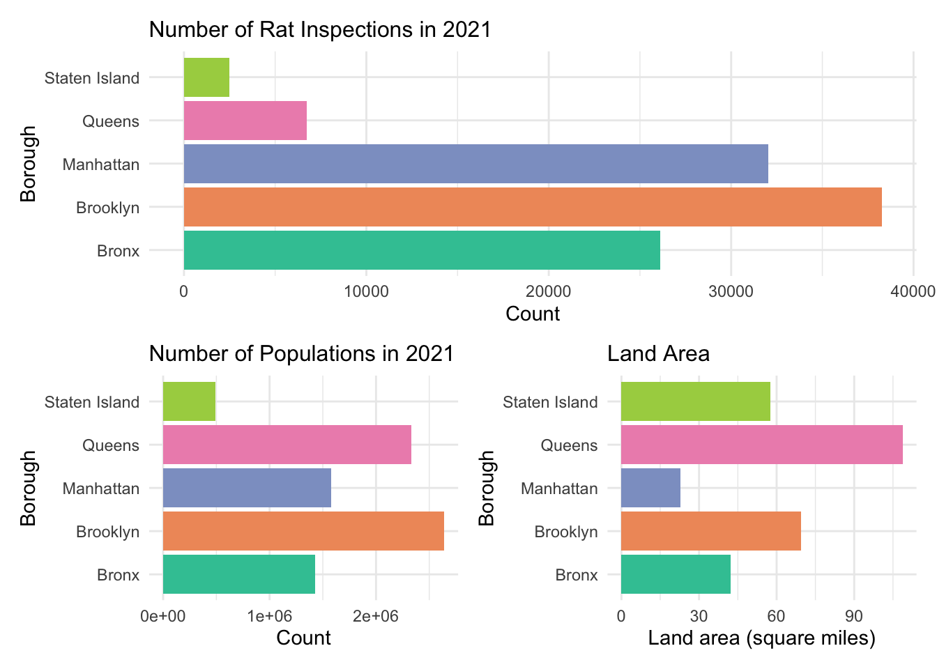
As for the rat density in terms of population, it turned out that Manhattan ranked the first with 0.020321 inspections per person. Similarly, when it comes to the density regarding land area, Manhattan, with 1411.6 inspections per square mile far higher than other four boroughs, won again. Undoubtfully, Manhattan was the most “rattiest” borough in New York City. Moreover, Queens and Staten Island were still the boroughs with least rat inspections.
boro = c(1, 2, 3, 4, 5)
rat_obs = c(26116, 38256, 32044, 6733, 2480)
pop = c(1424948, 2641052, 1576876, 2331143, 493494)
area = c(42.2, 69.4, 22.7, 108.7, 57.5)
df = tibble(boro, rat_obs, pop, area)

df = df %>%
  mutate(density_p = rat_obs /pop,
         density_a = rat_obs /area)

p_density_p = df %>%
  ggplot(aes(x = boro, y = density_p)) +
  geom_point(color = "#38C5A3") +
  geom_line(color = "#38C5A3") +
  labs(x = "Borough",
       y = "Count per person",
       title = "Rat Density - Population") +
  scale_x_continuous(
                labels = c("Bronx", "Brooklyn", "Manhattan", "Queens", "Staten Island")) +
  theme(axis.text = element_text(size = 7))


p_density_a = df %>%
  ggplot(aes(x = boro, y = density_a)) +
  geom_point(color = "#F09968") +
  geom_line(color = "#F09968") +
  labs(x = "Borough",
       y = "Count per square mile",
       title = "Rat Density - Land Area") +
  scale_x_continuous(
                labels = c("Bronx", "Brooklyn", "Manhattan", "Queens", "Staten Island")) +
  theme(axis.text = element_text(size = 7))


p_density_p + p_density_a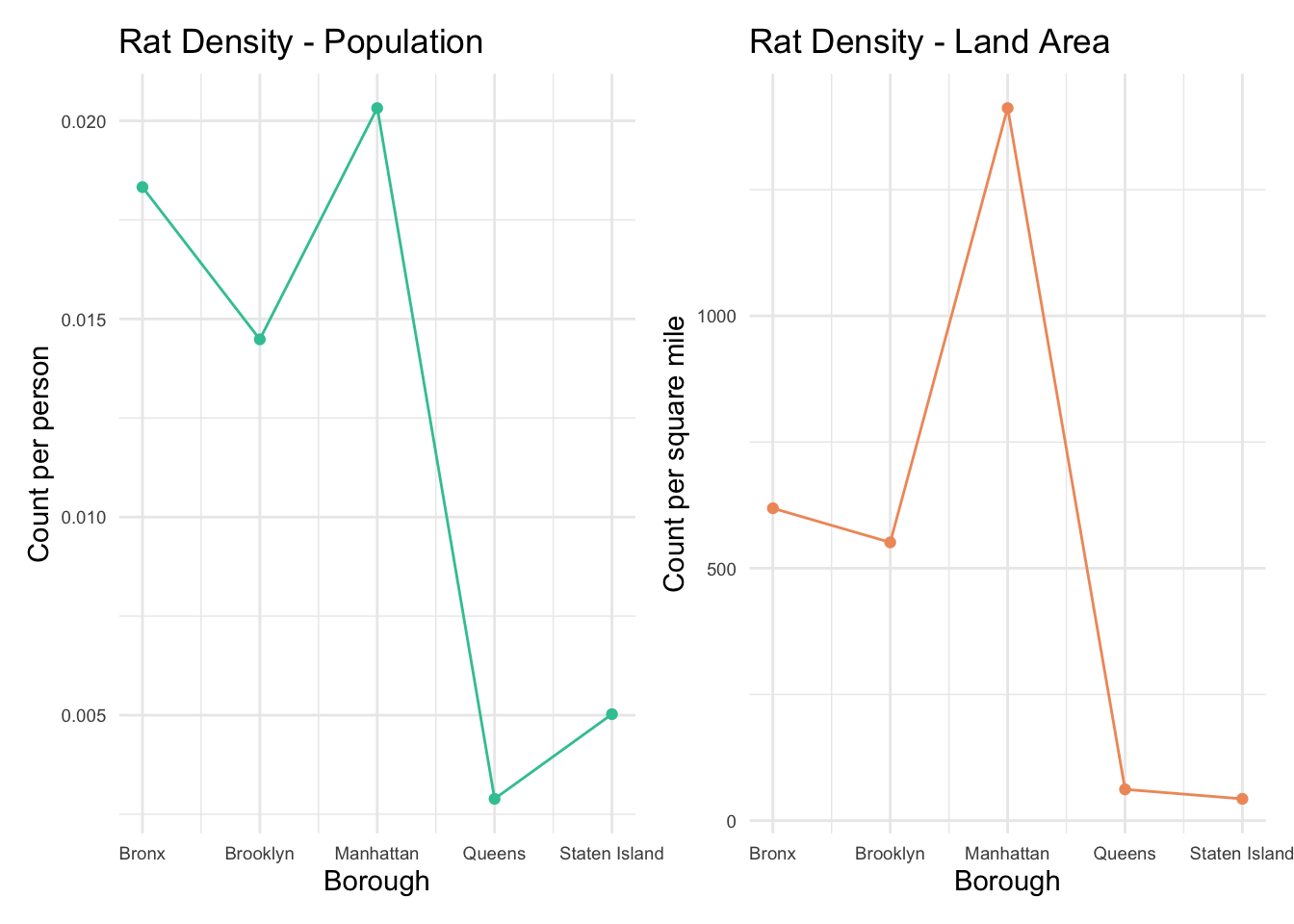
Rat Inspections by Month in Each Borough
In order to obtain more demographic information, we analyzed the rat inspections stratified by borough and month. Generally, for all five boroughs, more rats were inspected in late spring and summer in 2021, especially in July and August. Individually, Bronx, Brooklyn and Manhattan were above the borough average level while Queens and Staten Island were significantly below the average, which was consistent with our previous findings.
Bronx
avg_2021 = rat %>%
  filter(inspection_year == 2021) %>%
  mutate(inspection_month = as.factor(inspection_month)) %>%
  mutate(inspection_month = inspection_month %>%
                       fct_relevel("Jan", "Feb", "Mar","Apr","May", "Jun", "Jul", "Aug", "Sep", "Oct", "Nov", "Dec")) %>%
  group_by(inspection_year, inspection_month) %>%
  summarise(n_avg = n()/5)

rat %>%
  filter(borough == "Bronx") %>%
  filter(inspection_year == 2021) %>%
  mutate(inspection_month = as.factor(inspection_month)) %>%
  mutate(inspection_month = inspection_month %>%
                       fct_relevel("Jan", "Feb", "Mar","Apr","May", "Jun", "Jul", "Aug", "Sep", "Oct", "Nov", "Dec")) %>%
  group_by(inspection_year, inspection_month) %>%
  summarise(n_obs = n()) %>%
  mutate(avg_2021_n = c(822.2, 534.8, 1178.0, 1575.2, 2053.2, 2420.8, 3132.2, 3677.6, 1136.0, 701.4, 1969.0, 1925.4)) %>%
  plot_ly(x = ~inspection_month, y = ~n_obs, type = "bar",
          color = "#8DA0CB", alpha = 0.7,
          name = "Bronx") %>%
  add_trace(x = ~inspection_month,
            y = ~avg_2021_n,
            type = "scatter", mode = "lines+markers",
            color = "#F09968",
            name = "Borough Average") %>%
  layout(xaxis = list(title = "Month"),
         yaxis = list(title = "Count"),
         title = "Number of Rat Inspections in Bronx in 2021")
Brooklyn
rat %>%
  filter(borough == "Brooklyn") %>%
  filter(inspection_year == 2021) %>%
  mutate(inspection_month = as.factor(inspection_month)) %>%
  mutate(inspection_month = inspection_month %>%
                       fct_relevel("Jan", "Feb", "Mar","Apr","May", "Jun", "Jul", "Aug", "Sep", "Oct", "Nov", "Dec")) %>%
  group_by(inspection_year, inspection_month) %>%
  summarise(n_obs = n()) %>%
  mutate(avg_2021_n = c(822.2, 534.8, 1178.0, 1575.2, 2053.2, 2420.8, 3132.2, 3677.6, 1136.0, 701.4, 1969.0, 1925.4)) %>%
  plot_ly(x = ~inspection_month, y = ~n_obs, type = "bar",
          color = "#8DA0CB", alpha = 0.7,
          name = "Brooklyn") %>%
  add_trace(x = ~inspection_month,
            y = ~avg_2021_n,
            type = "scatter", mode = "lines+markers",
            color = "#F09968",
            name = "Borough Average") %>%
  layout(xaxis = list(title = "Month"),
         yaxis = list(title = "Count"),
         title = "Number of Rat Inspections in Brooklyn in 2021")
Manhattan
rat %>%
  filter(borough == "Manhattan") %>%
  filter(inspection_year == 2021) %>%
  mutate(inspection_month = as.factor(inspection_month)) %>%
  mutate(inspection_month = inspection_month %>%
                       fct_relevel("Jan", "Feb", "Mar","Apr","May", "Jun", "Jul", "Aug", "Sep", "Oct", "Nov", "Dec")) %>%
  group_by(inspection_year, inspection_month) %>%
  summarise(n_obs = n()) %>%
  mutate(avg_2021_n = c(822.2, 534.8, 1178.0, 1575.2, 2053.2, 2420.8, 3132.2, 3677.6, 1136.0, 701.4, 1969.0, 1925.4)) %>%
  plot_ly(x = ~inspection_month, y = ~n_obs, type = "bar",
          color = "#8DA0CB", alpha = 0.7,
          name = "Manhattan") %>%
  add_trace(x = ~inspection_month,
            y = ~avg_2021_n,
            type = "scatter", mode = "lines+markers",
            color = "#F09968",
            name = "Borough Average") %>%
  layout(xaxis = list(title = "Month"),
         yaxis = list(title = "Count"),
         title = "Number of Rat Inspections in Manhattan in 2021")
Queens
rat %>%
  filter(borough == "Queens") %>%
  filter(inspection_year == 2021) %>%
  mutate(inspection_month = as.factor(inspection_month)) %>%
  mutate(inspection_month = inspection_month %>%
                       fct_relevel("Jan", "Feb", "Mar","Apr","May", "Jun", "Jul", "Aug", "Sep", "Oct", "Nov", "Dec")) %>%
  group_by(inspection_year, inspection_month) %>%
  summarise(n_obs = n()) %>%
  mutate(avg_2021_n = c(822.2, 534.8, 1178.0, 1575.2, 2053.2, 2420.8, 3132.2, 3677.6, 1136.0, 701.4, 1969.0, 1925.4)) %>%
  plot_ly(x = ~inspection_month, y = ~n_obs, type = "bar",
          color = "#8DA0CB", alpha = 0.7,
          name = "Queens") %>%
  add_trace(x = ~inspection_month,
            y = ~avg_2021_n,
            type = "scatter", mode = "lines+markers",
            color = "#F09968",
            name = "Borough Average") %>%
  layout(xaxis = list(title = "Month"),
         yaxis = list(title = "Count"),
         title = "Number of Rat Inspections in Queens in 2021")
Staten Island
rat %>%
  filter(borough == "Staten Island") %>%
  filter(inspection_year == 2021) %>%
  mutate(inspection_month = as.factor(inspection_month)) %>%
  mutate(inspection_month = inspection_month %>%
                       fct_relevel("Jan", "Feb", "Mar","Apr","May", "Jun", "Jul", "Aug", "Sep", "Oct", "Nov", "Dec")) %>%
  group_by(inspection_year, inspection_month) %>%
  summarise(n_obs = n()) %>%
  mutate(avg_2021_n = c(822.2, 534.8, 1178.0, 1575.2, 2053.2, 2420.8, 3132.2, 3677.6, 1136.0, 701.4, 1969.0, 1925.4)) %>%
  plot_ly(x = ~inspection_month, y = ~n_obs, type = "bar",
          color = "#8DA0CB", alpha = 0.7,
          name = "Staten Island") %>%
  add_trace(x = ~inspection_month,
            y = ~avg_2021_n,
            type = "scatter", mode = "lines+markers",
            color = "#F09968",
            name = "Borough Average") %>%
  layout(xaxis = list(title = "Month"),
         yaxis = list(title = "Count"),
         title = "Number of Rat Inspections in Staten Island in 2021")
Overall Top 15 Rat Popular Streets
To be more detailed, we investigated the fifteen streets with most rat inspections in New York City. Among them, Greene Avenue, Brooklyn with 1366 cases, Broadway, Manhattan with 1154 cases and Hart Street, Brooklyn with 1118 cases ranked the top 3.
# Overall top 15 streets
rat %>%
  filter(inspection_year == 2021) %>%
  mutate(street_name = str_to_title(street_name)) %>%
  group_by(street_name) %>%
  summarise(rat_obs = n()) %>%
  arrange(-rat_obs) %>%
  top_n(20) %>%
  mutate(street_name = fct_reorder(street_name, rat_obs)) %>%
  plot_ly(x = ~rat_obs, y = ~street_name, color = ~street_name, type = "bar") %>%
  layout(xaxis = list(title = "Count"),
         yaxis = list(title = "Street"),
         title = "Top 15 Rat Popular Streets in 2021") %>%
  hide_legend()
Top 5 Rat Popular Streets
Below are the five streets with most rat inspections in each borough, respectively.
Bronx
rat %>%
  filter(inspection_year == 2021) %>%
  filter(borough == "Bronx") %>%
  mutate(street_name = str_to_title(street_name)) %>%
  group_by(street_name) %>%
  summarise(rat_obs = n()) %>%
  arrange(-rat_obs) %>%
  top_n(5) %>%
  mutate(street_name = fct_reorder(street_name, rat_obs)) %>%
  plot_ly(x = ~rat_obs, y = ~street_name, color = ~street_name, type = "bar") %>%
  layout(xaxis = list(title = "Count"),
         yaxis = list(title = "Street"),
         title = "Top 5 Rat Popular Streets in Bronx in 2021") %>%
  hide_legend()
Brooklyn
rat %>%
  filter(inspection_year == 2021) %>%
  filter(borough == "Brooklyn") %>%
  mutate(street_name = str_to_title(street_name)) %>%
  group_by(street_name) %>%
  summarise(rat_obs = n()) %>%
  arrange(-rat_obs) %>%
  top_n(5) %>%
  mutate(street_name = fct_reorder(street_name, rat_obs)) %>%
  plot_ly(x = ~rat_obs, y = ~street_name, color = ~street_name, type = "bar") %>%
  layout(xaxis = list(title = "Count"),
         yaxis = list(title = "Street"),
         title = "Top 5 Rat Popular Streets in Brooklyn in 2021") %>%
  hide_legend()
Manhattan
rat %>%
  filter(inspection_year == 2021) %>%
  filter(borough == "Manhattan") %>%
  mutate(street_name = str_to_title(street_name)) %>%
  group_by(street_name) %>%
  summarise(rat_obs = n()) %>%
  arrange(-rat_obs) %>%
  top_n(5) %>%
  mutate(street_name = fct_reorder(street_name, rat_obs)) %>%
  plot_ly(x = ~rat_obs, y = ~street_name, color = ~street_name, type = "bar") %>%
  layout(xaxis = list(title = "Count"),
         yaxis = list(title = "Street"),
         title = "Top 5 Rat Popular Streets in Manhattan in 2021") %>%
  hide_legend()
Queens
rat %>%
  filter(inspection_year == 2021) %>%
  filter(borough == "Queens") %>%
  mutate(street_name = str_to_title(street_name)) %>%
  group_by(street_name) %>%
  summarise(rat_obs = n()) %>%
  arrange(-rat_obs) %>%
  top_n(5) %>%
  mutate(street_name = fct_reorder(street_name, rat_obs)) %>%
  plot_ly(x = ~rat_obs, y = ~street_name, color = ~street_name, type = "bar") %>%
  layout(xaxis = list(title = "Count"),
         yaxis = list(title = "Street"),
         title = "Top 5 Rat Popular Streets in Queens in 2021") %>%
  hide_legend()
Staten Island
rat %>%
  filter(inspection_year == 2021) %>%
  filter(borough == "Staten Island") %>%
  mutate(street_name = str_to_title(street_name)) %>%
  group_by(street_name) %>%
  summarise(rat_obs = n()) %>%
  arrange(-rat_obs) %>%
  top_n(5) %>%
  mutate(street_name = fct_reorder(street_name, rat_obs)) %>%
  plot_ly(x = ~rat_obs, y = ~street_name, color = ~street_name, type = "bar") %>%
  layout(xaxis = list(title = "Count"),
         yaxis = list(title = "Street"),
         title = "Top 5 Rat Popular Streets in Staten Island in 2021") %>%
  hide_legend()
Inspection Types and Results
Inspection type and result were two important attributes, which reflect the motivation, method and result of rat inspections. In addition, some other problem conditions such as garbage (poor containerization of food waste resulting in the feeding of rats), harborage (clutter and dense vegetation promoting the nesting of rats), could be identified during this process.
Inspection Types
We can easily observed that initial inspection was the most frequent inspection, accounted for 70.3%. It represents inspection conducted in response to a 311 complaint, or a proactive inspection conducted through our neighborhood indexing program. Baiting and compliance (follow-up) inspection followed. It’s very rare to see clean-up and stoppage in the inspection process.
# inspection type
colors = c("#38C5A3", "#F09968", "#D2959B", "#B499CB", "#EE90BA", "#A8D14F", "#E5D800", "#FCCD4C", "#E2BF96", "#B3B3B3")

rat %>%
  mutate(inspection_type = case_when(inspection_type == "Initial" ~ "Initial Inspection",
                                     inspection_type == "BAIT" ~ "Baiting",
                                     inspection_type == "Compliance"~ "Compliance Inspection",
                                     inspection_type == "STOPPAGE" ~ "Stoppage",
                                     inspection_type == "CLEAN_UPS" ~ "Clean Up")) %>%
  group_by(inspection_type) %>%
  summarise(n_obs = n(),
            prop = n_obs/nrow(rat)) %>%
  arrange(-prop) %>%
  mutate(inspection_type = fct_reorder(inspection_type, -prop)) %>%
  plot_ly(labels = ~inspection_type, values = ~prop, type = "pie",
          insidetextfont = list(color = "#FFFFFF"),
          marker = list(colors = colors,
                      line = list(color = '#FFFFFF', width = 1))
          ) %>%
  layout(title = "Distribution of Inspection Type",
         xaxis = list(showgrid = FALSE, zeroline = FALSE, showticklabels = FALSE),
         yaxis = list(showgrid = FALSE, zeroline = FALSE, showticklabels = FALSE))
Inspection Results
The result of passed had the largest proportion, accounting for 61.6%. Even though in such circumstances, inspector recieved the rat complains but did not observe active signs of rat and mouse activity, or conditions conducive to rodent activity, on the property, we cannot say there was no rats due to their high speed of scurry and wide range of activity. Particularly, 13.6% of results were rat activity. We would like to mention here that active rat signs include any of six different signs below:
- fresh tracks
- fresh droppings
- active burrows
- active runways and rub marks
- fresh gnawing marks
- live rats
# inspection results
colors = c("#38C5A3", "#F09968", "#D2959B", "#B499CB", "#EE90BA", "#A8D14F", "#E5D800", "#FCCD4C", "#E2BF96", "#B3B3B3")

rat %>%
  drop_na() %>%
  group_by(result) %>%
  summarise(n_obs = n(),
            prop = n_obs/nrow(rat)) %>%
  arrange(-prop) %>%
  mutate(result = fct_reorder(result, -prop)) %>%
  plot_ly(labels = ~result, values = ~prop, type = "pie",
          insidetextfont = list(color = "#FFFFFF"),
          marker = list(colors = colors,
                      line = list(color = '#FFFFFF', width = 1))
          ) %>%
  layout(title = "Distribution of Inspection Results",
         xaxis = list(showgrid = FALSE, zeroline = FALSE, showticklabels = FALSE),
         yaxis = list(showgrid = FALSE, zeroline = FALSE, showticklabels = FALSE))
Weather and COVID-19
From previous analysis, we found that weather and COVID-19 were two
potential covariates that might affect the rat inspections. As is known
to all, rats don’t prefer the cold weather but gravitate to temperatures
between 30 and 32 degrees Celsius.
In March 2020, countries around the world including the U.S. deployed
various measures of lockdown that lasted on for over a year. This
response to the pandemic dominated people’s daily lives: they rarely
went outside and basically worked from home. As a result, rats lost
their “sweet home” and the number of inspections might become
smaller.
Weather
Based on the whole range of temperatures in 2021, we found that more rat inspections happened when temperatures were between 20 and 30 degrees Celsius, indicating that rats preferred a warm environment. However, the pattern was not that obvious and the temperatures were almost above 0 degree Celsius in 2021. We could not immediately determine whether rats seldom wandered outside when the temperatures were extremely low.
Inspection
# association with temperature
rat_n = rat %>%
  filter(inspection_year == 2021) %>%
  group_by(inspection_year, inspection_month, inspection_day) %>%
  summarise(Count = n())

t = rat %>%
  filter(inspection_year == 2021) %>%
  mutate(`Average Temperature` = (tmin+tmax)/2) %>%
  rename(Date = date) %>%
  distinct(inspection_year, inspection_month, inspection_day, `Average Temperature`, tmax, tmin, Date)

rat_t = left_join(rat_n, t, by = c("inspection_year", "inspection_month", "inspection_day")) %>%
  as.data.frame()

p_weather = rat_t %>%
  ggplot(aes(x = Date, y = `Average Temperature`)) +
  geom_point(aes(size = Count), alpha = .5, color = "#66C2A5") +
  geom_smooth(se = FALSE, color = "#8DA0CB") +
  labs(x = "Month",
       y = "Average Temperature",
       title = "Assocition Between Number of Rat Inspections and Temperature in 2021")

ggplotly(p_weather)
Observed
# association with temperature
rat_n_o = rat %>%
  filter(!result == "Passed") %>%
  filter(inspection_year == 2021) %>%
  group_by(inspection_year, inspection_month, inspection_day) %>%
  summarise(Count = n())

t = rat %>%
  filter(inspection_year == 2021) %>%
  mutate(`Average Temperature` = (tmin+tmax)/2) %>%
  rename(Date = date) %>%
  distinct(inspection_year, inspection_month, inspection_day, `Average Temperature`, tmax, tmin, Date)

rat_t_o = left_join(rat_n_o, t, by = c("inspection_year", "inspection_month", "inspection_day")) %>%
  as.data.frame()

p_weather_o = rat_t_o %>%
  ggplot(aes(x = Date, y = `Average Temperature`)) +
  geom_point(aes(size = Count), alpha = .5, color = "#66C2A5") +
  geom_smooth(se = FALSE, color = "#8DA0CB") +
  labs(x = "Month",
       y = "Average Temperature",
       title = "Assocition Between Number of Observed Rats and Temperature in 2021")

ggplotly(p_weather_o)
COVID-19
Line charts were utilized to compare the rat inspections before and after COVID-19. It’s very obvious that after the outbreak of COVID-19, the number of sightings significantly dropped, approximately from 20,000 to 5,000 per month. In April 2021, only 3 cases of rat inspections were recorded.
# changes before and after Covid-19
rat %>%
  filter(inspection_year %in% c(2019, 2020)) %>%
  mutate(inspection_year = as.factor(inspection_year)) %>%
  mutate(inspection_month = as.factor(inspection_month)) %>%
  mutate(inspection_month = inspection_month %>%
                       fct_relevel("Jan", "Feb", "Mar","Apr","May", "Jun", "Jul", "Aug", "Sep", "Oct", "Nov", "Dec")) %>%
  group_by(inspection_year, inspection_month) %>%
  summarise(n_obs = n()) %>%
  plot_ly(x = ~inspection_month, y = ~n_obs, type = "scatter", mode = "lines",
          color = ~inspection_year) %>%
  layout(xaxis = list(title = "Inspection Month"),
         yaxis = list(title = "Number of Inspections"),
         title = "Comparison of Rat Inspections Before and After COVID-19")
We also explored the association between the number of rat inspections and COVID-ID cases. This plot removed the outliers of extremely high daily confirmed cases to focus on the trend. Generally speaking, as the surge of COVID-19 confirmed cases, the number of rat inspections presented a decreasing trend. This finding verified our thought that lockdown policy and self-quarantine reduced the inspection chances and made rats lose their survival environment.
# association with Covid-19
rat_obs = rat %>%
  group_by(date) %>%
  summarise(Count = n())

c = rat_covid %>%
  distinct(inspection_year, inspection_month, inspection_day, total_case_count, date)

rat_covid_c = left_join(c, rat_obs, by = "date") %>%
  select(inspection_year, date, Count, total_case_count) %>%
  as.data.frame()

p_covid = rat_covid_c %>%
  filter(total_case_count<=2000) %>%
  rename(Date = date,
         `COVID-19 Cases` = total_case_count,
         `Rat Inspections` = Count) %>%
  ggplot(aes(x = Date)) +
  geom_smooth(aes(y = `COVID-19 Cases`, color = "COVID-19"), se = FALSE) +
  geom_smooth(aes(y = `Rat Inspections`, color = "Rat"), se = FALSE) +
  labs(x = "Month",
       y = "Number of Cases",
       title = "Assocition Between Number of Rat Inspections and COVID-19",
       color = "Type") +
  scale_color_manual(values = c("Rat" = "#8DA0CB", "COVID-19" = "#66C2A5"))

ggplotly(p_covid)
Summaries
Based on the comprehensive analyses, we mainly found that:
- From 2012 to 2019, the number of rat inspections presented a continual increasing trend while it appeared a sharp decrease as the outbreak of COVID-19 in 2020.
- Brooklyn had the largest number of rat inspections while Manhattan had the highest density of rat inspections, regardless of count per-person or per-area.
- More rat inspections happened when temperatures were between 20 and 30 degrees Celsius but this pattern was not significant.