REPORT


Motivation

New York City is one of the largest and most popular cities in the United States. It is popular for its hustle and bustle, Wall Street legends and Broadway shows. It looks like the city never sleeps. Whenever you go outside, you will see people walking here and there and doing some sorts of things. However, like humans, rats are present in the city in a large number, with an estimate number of 2 million.

NYC rats, also known as Norway rats, first came to New York City in the 18th century, and as the city’s population grew, so did the rodent population. New York city harbors one of the largest rat populations in the United States. Thus, with time, the issue of rats is quite serious and is even getting worse.

Surprisingly, NYC is setting a record in 2022 for rat sightings, with 16,000 rodents sightings reported through the end of July. During the pandemic, reported rat sightings, health inspections finding evidence of rat activity and cases of a disease spread via rat urine are all on the rise, which raised our concerns.

Therefore, by combining the COVID case count and weather information, we are intended to provide an in-depth look at NYC rat inspection database with an exploratory data analysis, as well as statistical analysis including hypothesis test and regression analysis. Gaining deeper insights into the pattern and characteristics of rat inspections in both the temporal and spatial dimensions will help those in fear of rats minimize exposure as much as possible. Broadly, it is beneficial to identify potential risks of disease-spread and then build a clean and pleasant living environment, which is what we as public health students should be working towards.


Research Questions

Inspired by the others’ work, we proposed the following questions:

  • How does the rat population distribute by different time and borough?
  • Is there any relationship between rat population and potential factors (i.e. temporal, spatial, climatic and COVID-associated factors)?
  • What are the future trends for rat populations in NYC?
  • Are there any boroughs or months with a significantly higher chance of observing a rat?

Detailed information concerning our data analysis project plan can be found in our proposal.


Data

Data Sources

DOHMH Rodent Inspection Data

The rodent inspection data contains the information on rat sightings and intervention visits in NYC from 1918 to 2022, which is managed by New York City Department of Health and Mental Hygiene, Division of Environmental Health. The data source is the Veterinary, Rodent and Vector Surveillance System (VRVSS). It is also available on the Rat Information Portal, which is a web-based mapping application where users can view and map rat inspection and intervention data. Users can search results from Health Department inspections for rats at the level of individual properties, and view neighborhood maps.

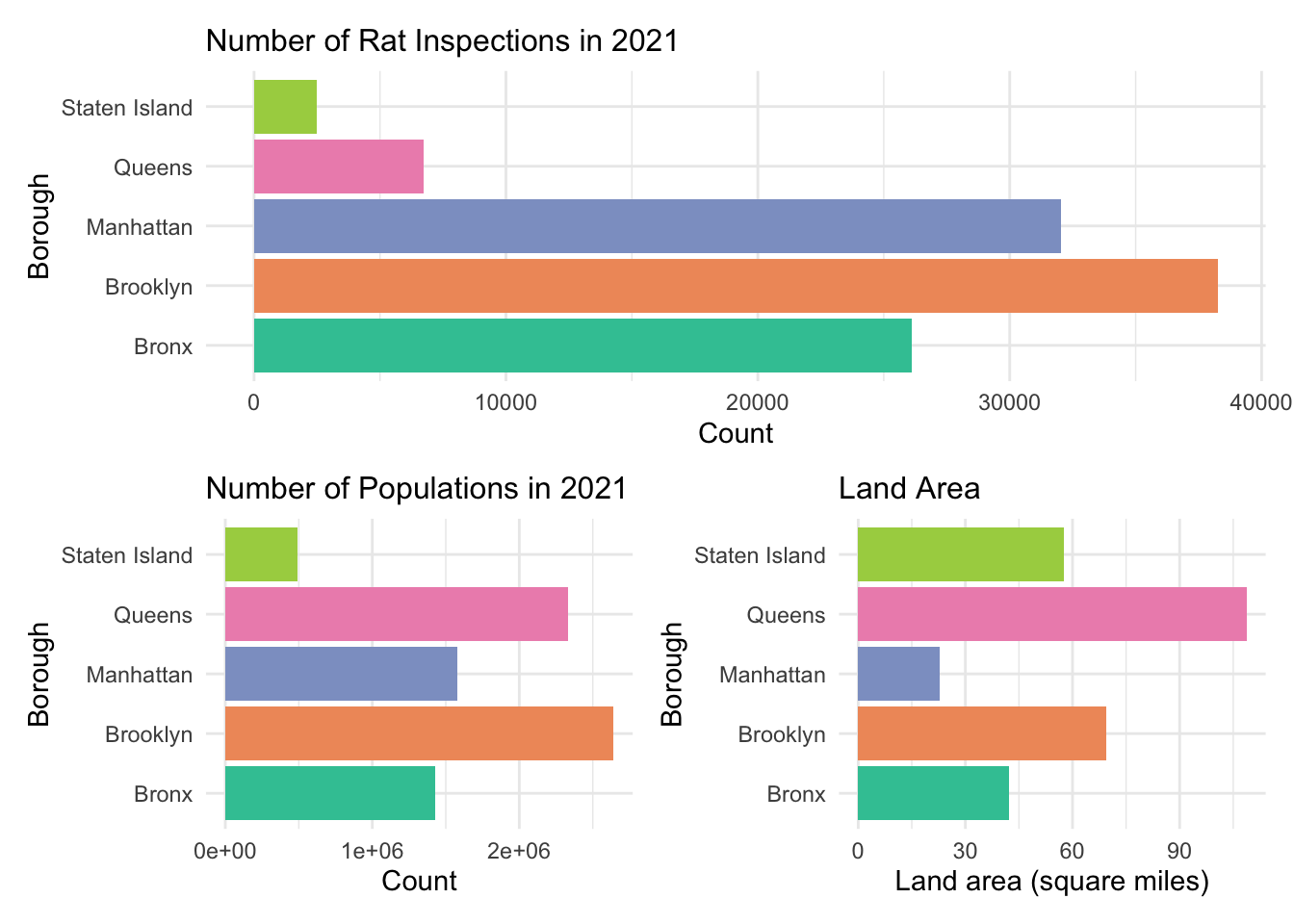
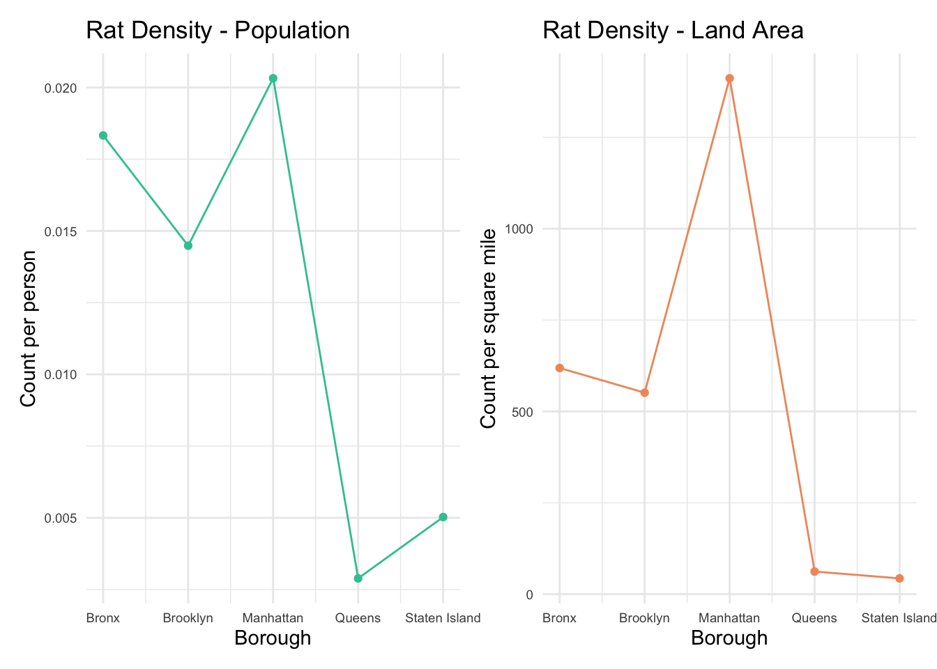
What should to be mentioned is that most of the inspection is due to the complaints from the general public. Thus, if a property/taxlot does not appear in the file, which does not indicate an absence of rats - rather just that it has not been inspected. Similarly, neighborhoods with higher numbers properties with active rat signs may not actually have higher rat populations but simply have more inspections.


NYC Daily Weather Data

The NYC daily weather data from the National Oceanic and Atmospheric Association (NOAA) of the National Centers for Environmental Information (NCEI), consists of the NYC daily climate observations from the Central Park station (id: USW00094728), which is integrated by the GHCN (Global Historical Climatology Network)-Daily database. The data is also available to be retrieved using R functions from the rnoaa package.

Global Historical Climate Network includes daily land surface observations from over 100,000 stations in 180 countries and territories. The GHCN-Daily was developed to meet the needs of climate analysis and monitoring studies that require data at a sub-monthly time resolution (e.g., assessments of the frequency of heavy rainfall, heat wave duration, etc.). NCEI provides numerous daily variables, including maximum and minimum temperature, total daily precipitation, snowfall, and snow depth; however, about one half of the stations report precipitation only. Both the record length and period of record vary by station and cover intervals ranging from less than a year to more than 175 years.


NYC COVID-19 Daily Case Count Data

The NYC COVID-19 daily case count data, provided by New York City Department of Health and Mental Hygiene (DOHMH), represents citywide and borough-specific daily counts of COVID-19 confirmed cases and COVID-related hospitalizations and confirmed and probable deaths among New York City residents. The case counts are aggregated by date of diagnosis (i.e., date of specimen collection), and the hospitalization cases areaggregated by date of admission, and death cases are aggregated by date of death.

Data collection is since February 29, 2020, which is the date that the Health Department classifies as the start of the COVID-19 outbreak in NYC as it was the date of the first laboratory-confirmed COVID-19 case. Data on confirmed cases were passively reported to the NYC Health Department by hospital, commercial, and public health laboratories. In March, April, and early May, the NYC Health Department had discouraged people with mild and moderate symptoms from being tested, so our data primarily represent people with more severe illness. Until mid-May, patients with more severe COVID-19 illness were more likely to have been tested and included in these data. Data on hospitalizations for confirmed COVID-19 cases were obtained from direct remote access to electronic health record systems, regional health information organization (RHIOs), and NYC Health and Hospital information, as well as matching to syndromic surveillance. Deaths were confirmed by the New York City Office of the Chief Medical Examiner and the Health Department’s Bureau of Vital Statistics. Data counts are underestimates. This dataset has been available to the public since May 19, 2020, and is updated on a daily basis.

These data can be used to:

  • Identify temporal trends in the number of persons diagnosed with COVID-19, citywide and by borough.
  • Identify temporal trends in the numbers of COVID-19-related hospitalizations and deaths, citywide and by borough.


NYC Borough Population Data

The NYC borough population data, provided by City Population, consists of the population of the boroughs of New York City according to the U.S. Census Bureau results. Additional information about the population structure including gender, age groups, age distribution, race, ethnicity can be also found.


Data Cleaning

Due to the large size of our final project datasets, another repository is created for storing tidied data. The codes below describes the steps we took to collate and merge dataset we used in the following exploratory and statistical analysis. Moreover, the detailed data preprocessing procedures can be find here.

# deal with rat inspection data
url_rat = "https://data.cityofnewyork.us/OData.svc/p937-wjvj"
rat = read.socrata(url_rat) %>% 
  janitor::clean_names()

rat_tidy = rat %>%
  select(inspection_type, bbl, zip_code, street_name, latitude, longitude, borough, result, inspection_date, approved_date) %>%
  drop_na() %>% 
  mutate(boro_code = substr(bbl, 1, 1),
         block = substr(bbl, 2, 6),
         lot = substr(bbl, 7, 10)) %>% 
  select(inspection_type, boro_code, block, lot, zip_code, street_name, latitude, longitude, borough, result, inspection_date, approved_date) %>% 
  separate(inspection_date, c("inspection_date", "inspection_time"), " ") %>% 
  separate(inspection_date, c("inspection_year", "inspection_month", "inspection_day"), "-") %>%
  separate(approved_date, c("approved_date", "approved_time"), " ") %>% 
  separate(approved_date, c("approved_year", "approved_month", "approved_day"), "-") %>%
  mutate(inspection_year = as.integer(inspection_year), 
         inspection_month = as.integer(inspection_month), 
         inspection_day = as.integer(inspection_day)) %>%
  mutate(approved_year = as.integer(approved_year), 
         approved_month = as.integer(approved_month), 
         approved_day = as.integer(approved_day)) %>%
  relocate(inspection_year, .before = "inspection_month") %>% 
  relocate(approved_year, .before = "approved_month") %>%
  arrange(inspection_year, inspection_month) %>% 
  mutate(inspection_month = month.abb[inspection_month],
         approved_month = month.abb[approved_month]) %>% 
  filter(inspection_year >= 2012 & inspection_year <= 2021)


# deal with weather data
nycstationsid = ghcnd_stations() %>% 
  filter(id == "USW00094728") %>% 
  distinct(id)

nyc_weather = meteo_pull_monitors(nycstationsid$id, 
                             date_min = "2012-01-01", 
                             date_max = "2021-12-31",
                             var = c("PRCP", "SNOW", "SNWD", "TMAX", "TMIN"))

nyc_weather_tidy = nyc_weather %>% 
  janitor::clean_names() %>%
  separate(date, into = c("year", "month", "day")) %>% 
  mutate(year = as.numeric(year),
         month = month.abb[as.numeric(month)],
         day = as.numeric(day)) %>%
  mutate(prcp = prcp/10,
         tmax = tmax/10,
         tmin = tmin/10) 


# deal with covid data
url_covid = "https://data.cityofnewyork.us/OData.svc/rc75-m7u3"
covid = read.socrata(url_covid) %>% 
  janitor::clean_names() 

covid_tidy = covid %>%
  rename(date = date_of_interest) %>% 
  select(date, contains("case_count")) %>% 
  select(-contains(c("probable_case_count", "case_count_7day_avg", "all_case_count_7day_avg"))) %>%
  separate(date, into = c("year", "month", "day")) %>% 
  mutate(year = as.numeric(year),
         month = month.abb[as.numeric(month)],
         day = as.numeric(day)) %>%
  pivot_longer(
    cols = bx_case_count:si_case_count,
    names_to = "borough",
    values_to = "borough_case_count"
  ) %>% 
  mutate(borough = gsub("_case_count", "", borough)) %>% 
  mutate(borough = dplyr::recode(borough, "bx" = "Bronx","bk" = "Brooklyn","mn" = "Manhattan","si" = "Staten Island","qn" = "Queens")) %>% 
  relocate(case_count, .after = borough_case_count) %>% 
  rename(total_case_count = case_count) 


# merge the above dataframe with covid info.
rat_weather_covid = rat_tidy %>% 
  filter(inspection_year %in% c(2020,2021)) %>% 
  merge(nyc_weather_tidy, by.x = c("inspection_year","inspection_month","inspection_day"), by.y = c("year","month","day")) %>% 
  select(-id) %>% 
  merge(covid_tidy, by.x = c("inspection_year","inspection_month","inspection_day","borough"), by.y = c("year","month","day","borough"))


After cleaning the datasets mentioned above, our tidied and aggregated data has a total of 1,679,675 rows, one for each rat inspection record, and is the basis of our exploratory and statistical analysis. Altogether 24 variables are selected as meaningful and valuable. The specific variable names and their corresponding explanation are listed below:

  • inspection_year: year of the inspection
  • inspection_month: month of the inspection
  • inspection_day: day of the inspection
  • boro_code: code assigned to the NYC borough
  • block: block number for the inspected taxlot; block numbers repeat in different boroughs
  • lot: lot number for the inspected taxlot (Notes: lot numbers can repeat in different blocks)
  • zip_code: postal zipcode of the taxlot that was inspected
  • street_name:
  • latitude: latitude in decimal degrees of the inspected taxlot (WGS 1984)
  • longitude: longitude in decimal degrees of the inspected taxlot (WGS 1984)
  • borough: name of the NYC borough
  • result: result of the inspection including Active Rat Signs (ARS) and Problem Conditions
  • inspection_time: time of the inspection.
  • approved_year: year of the inspection approved by supervisor at DOHMH
  • approved_month: month of the inspection approved by supervisor at DOHMH
  • approved_day: day of the inspection approved by supervisor at DOHMH
  • approved_time: time of the inspection approved by supervisor at DOHMH
  • prcp: precipitation (mm)
  • snow: snowfall (mm)
  • snwd: snow depth (mm)
  • tmax: maximum temperature (°C)
  • tmin: minimum temperature (°C)
  • borough_case_count: count of patients tested who were confirmed to be COVID-19 cases on date_of_interest in borough_of_interest
  • total_case_count: total count of patients tested who were confirmed to be COVID-19 cases on date_of_interest in NYC


Exploratory Data Analysis

Time Visualizations

Overall Rat Inspections Across Time

First, a time series plot was used to illustrate data points at successive intervals of time. From 2012, the number of rat inspections continually presented a increasing trend and reached its peak in 2018. After 2020, it appeared a sharp decrease as the outbreak of COVID-19.

by_date = rat %>% 
  group_by(date) %>% 
  summarise(Total = n())

time_series = xts(by_date$Total , order.by= by_date$date)

hchart(time_series, name = "Rat Inspections") %>% 
  hc_credits(enabled = TRUE, text = "Sources: NYC OpenData", style = list(fontSize = "12px")) %>%
  hc_title(text = "Time Series of NYC Rat Inspections") %>%
  hc_legend(enabled = TRUE)


Rat Inspections by Year

To be more specific, we compared the rat inspections year by year. The number was roughly around 150,000 in 2012-2016. There was a surge of rat inspections in 2017 which had 247,985 cases. After staying at the peak in 2018-2019, the number of inspections rapidly dropped to 71,770 in 2020. Whether this drop was associated with COVID-19 will be analyzed in the following section.

rat %>%
  mutate(inspection_year = as.factor(inspection_year)) %>%
  group_by(inspection_year) %>%
  summarise(n_obs = n()) %>%
  plot_ly(x = ~inspection_year, y = ~n_obs, type = "scatter", mode = "lines+markers") %>%
  layout(xaxis = list(title = "Year"), 
         yaxis = list(title = "Count"),
         title = "Number of Rat Inspections by Year") 


Rat Inspections by Month

The average number of rat inspections was 13,997. We plotted the number of inspections every months across years and found that rats were more likely to be inspected in spring compared to winter. This might be due to the nicer weather in spring, suitable for rats to wander outside.

rat %>%
  mutate(inspection_month = as.factor(inspection_month)) %>%
  mutate(inspection_month = inspection_month %>% 
                       fct_relevel("Jan", "Feb", "Mar","Apr","May", "Jun", "Jul", "Aug", "Sep", "Oct", "Nov", "Dec")) %>%
  group_by(inspection_year, inspection_month) %>%
  summarise(n_obs = n()) %>%
  plot_ly(x = ~inspection_month, y = ~n_obs, type = "box",
          color = ~inspection_month) %>%
  layout(xaxis = list(title = "Month"), 
         yaxis = list(title = "Count"),
         title = "Number of Rat Inspections by Month") %>%
  hide_legend()


Rat Inspections Througout a Day

Most rat inspections happened at daytime regardless of the month, concentrated at 9am-12pm. Contradicted with the common sense that rats prefer nightlife, this finding would be corresponding to inspectors’ daily schedule. Additionally, there are a few explanations for observing rat during daylight hours:

  • The infestation is large
  • The older/sub-dominant rats cannot compete with dominant rats for food during the safer night time period
Inspection
rat_2021 %>%
  mutate(inspection_day = as.factor(inspection_day)) %>%
  mutate(inspection_month = as.factor(inspection_month)) %>%
  mutate(inspection_month = inspection_month %>% 
                       fct_relevel("Jan", "Feb", "Mar","Apr","May", "Jun", "Jul", "Aug", "Sep", "Oct", "Nov", "Dec")) %>%
  separate(inspection_time, into = c("hour", "minute", "second")) %>%
  rename(Month = inspection_month) %>%
  group_by(Month, inspection_day, hour) %>%
  summarise(n_obs = n()) %>%
  plot_ly(x = ~hour, y = ~n_obs, type = "scatter",
          color = ~inspection_day,
          frame = ~Month) %>%
  layout(xaxis = list(title = "Time", range = list(0,24), dtick = 3, 
                      tickvals = c(0, 3, 6, 9, 12, 15, 18, 21, 24),
                      ticktext = c("12am", "3am", "6am", "9am", "12pm", "3pm", "6pm", "9pm", "12am")),
         yaxis = list(title = "Count"),
         title = "Number of Rat Inspections Throughout a Day in 2021") %>%
  hide_legend()


Observed
rat_2021 %>%
  filter(!result == "Passed") %>%
  mutate(inspection_day = as.factor(inspection_day)) %>%
  mutate(inspection_month = as.factor(inspection_month)) %>%
  mutate(inspection_month = inspection_month %>% 
                       fct_relevel("Jan", "Feb", "Mar","Apr","May", "Jun", "Jul", "Aug", "Sep", "Oct", "Nov", "Dec")) %>%
  separate(inspection_time, into = c("hour", "minute", "second")) %>%
  rename(Month = inspection_month) %>%
  group_by(Month, inspection_day, hour) %>%
  summarise(n_obs = n()) %>%
  plot_ly(x = ~hour, y = ~n_obs, type = "scatter",
          color = ~inspection_day,
          frame = ~Month) %>%
  layout(xaxis = list(title = "Time", range = list(0,24), dtick = 3, 
                      tickvals = c(0, 3, 6, 9, 12, 15, 18, 21, 24),
                      ticktext = c("12am", "3am", "6am", "9am", "12pm", "3pm", "6pm", "9pm", "12am")),
         yaxis = list(title = "Count"),
         title = "Number of Observed Rats Throughout a Day in 2021") %>%
  hide_legend()


Borough Visualizations

Overall Rat Inspections by Borough

First, let’s look at the overall rat inspections in each borough across years. Brooklyn, Bronx and Manhattan always ranked top 3 most rat inspections while Queens and Staten Island had quite fewer inspections.

# Overall
rat %>%
 mutate(borough = as.factor(borough)) %>%
  rename(Year = inspection_year) %>%
  group_by(Year, borough) %>%
  summarise(n_obs = n()) %>%
  plot_ly(x = ~borough, y = ~n_obs, color = ~borough, frame = ~Year, type = "bar") %>%
  layout(xaxis = list(title = "Borough"), 
         yaxis = list(title = "Count"),
         title = "Number of Rat Inspections by Borough") %>%
  hide_legend()


Rat Inspections VS. Population

It’s not sufficient and solid to only go through the number of rat inspections in each borough without considering their populations and land area. Therefore, we combined these factors in certain borough to evaluate the rat density.

In 2021, Brooklyn had 38,256 rat inspections, which was the most, followed by Manhattan, Bronx, Queens and Staten Island.

# rat vs. population
p_rat = rat %>%
  filter(inspection_year == 2021) %>%
  mutate(borough = as.factor(borough)) %>%
  group_by(borough) %>%
  summarise(rat_obs = n()) %>%
  ggplot(aes(x = rat_obs, y = borough, fill = borough)) +
  geom_col(show.legend = FALSE) +
  scale_fill_manual(values = c("#38C5A3", "#F09968", "#8DA0CB", "#EE90BA", "#A8D14F")) +
  labs(x = "Count",
       y = "Borough",
      titles = "Number of Rat Inspections in 2021") +
  theme(plot.title = element_text(size = 12)) 

p_pop = rat %>%
  filter(inspection_year == 2021) %>%
  mutate(borough = as.factor(borough)) %>%
  group_by(borough) %>%
  summarise(rat_obs = n()) %>%
  mutate(pop = c(1424948, 2641052, 1576876, 2331143, 493494)) %>%
  ggplot(aes(x = pop, y = borough, fill = borough)) +
  geom_col(show.legend = FALSE) +
  scale_fill_manual(values = c("#38C5A3", "#F09968", "#8DA0CB", "#EE90BA", "#A8D14F")) +
  labs(x = "Count",
       y = "Borough",
       titles = "Number of Populations in 2021") +
  theme(plot.title = element_text(size = 12))

p_area = rat %>%
  filter(inspection_year == 2021) %>%
  mutate(borough = as.factor(borough)) %>%
  group_by(borough) %>%
  summarise(rat_obs = n()) %>%
  mutate(area = c(42.2, 69.4, 22.7, 108.7, 57.5)) %>%
  ggplot(aes(x = area, y = borough, fill = borough)) +
  geom_col(show.legend = FALSE) +
  scale_fill_manual(values = c("#38C5A3", "#F09968", "#8DA0CB", "#EE90BA", "#A8D14F")) +
  labs(x = "Land area (square miles)",
       y = "Borough",
       titles = "Land Area") +
  theme(plot.title = element_text(size = 12))


p_rat / (p_pop + p_area)

As for the rat density in terms of population, it turned out that Manhattan ranked the first with 0.020321 inspections per person. Similarly, when it comes to the density regarding land area, Manhattan, with 1411.6 inspections per square mile far higher than other four boroughs, won again. Undoubtfully, Manhattan was the most “rattiest” borough in New York City. Moreover, Queens and Staten Island were still the boroughs with least rat inspections.

boro = c(1, 2, 3, 4, 5)
rat_obs = c(26116, 38256, 32044, 6733, 2480)
pop = c(1424948, 2641052, 1576876, 2331143, 493494)
area = c(42.2, 69.4, 22.7, 108.7, 57.5)
df = tibble(boro, rat_obs, pop, area)

df = df %>%
  mutate(density_p = rat_obs /pop,
         density_a = rat_obs /area) 

p_density_p = df %>%
  ggplot(aes(x = boro, y = density_p)) +
  geom_point(color = "#38C5A3") +
  geom_line(color = "#38C5A3") +
  labs(x = "Borough",
       y = "Count per person",
       title = "Rat Density - Population") +
  scale_x_continuous(
                labels = c("Bronx", "Brooklyn", "Manhattan", "Queens", "Staten Island")) +
  theme(axis.text = element_text(size = 7))


p_density_a = df %>%
  ggplot(aes(x = boro, y = density_a)) +
  geom_point(color = "#F09968") +
  geom_line(color = "#F09968") +
  labs(x = "Borough",
       y = "Count per square mile",
       title = "Rat Density - Land Area") +
  scale_x_continuous(
                labels = c("Bronx", "Brooklyn", "Manhattan", "Queens", "Staten Island")) +
  theme(axis.text = element_text(size = 7))
  

p_density_p + p_density_a


Rat Inspections by Month in Each Borough

In order to obtain more demographic information, we analyzed the rat inspections stratified by borough and month. Generally, for all five boroughs, more rats were inspected in late spring and summer in 2021, especially in July and August. Individually, Bronx, Brooklyn and Manhattan were above the borough average level while Queens and Staten Island were significantly below the average, which was consistent with our previous findings.

Bronx
avg_2021 = rat %>%
  filter(inspection_year == 2021) %>%
  mutate(inspection_month = as.factor(inspection_month)) %>%
  mutate(inspection_month = inspection_month %>% 
                       fct_relevel("Jan", "Feb", "Mar","Apr","May", "Jun", "Jul", "Aug", "Sep", "Oct", "Nov", "Dec")) %>%
  group_by(inspection_year, inspection_month) %>%
  summarise(n_avg = n()/5)

rat %>%
  filter(borough == "Bronx") %>%
  filter(inspection_year == 2021) %>%
  mutate(inspection_month = as.factor(inspection_month)) %>%
  mutate(inspection_month = inspection_month %>% 
                       fct_relevel("Jan", "Feb", "Mar","Apr","May", "Jun", "Jul", "Aug", "Sep", "Oct", "Nov", "Dec")) %>%
  group_by(inspection_year, inspection_month) %>%
  summarise(n_obs = n()) %>%
  mutate(avg_2021_n = c(822.2, 534.8, 1178.0, 1575.2, 2053.2, 2420.8, 3132.2, 3677.6, 1136.0, 701.4, 1969.0, 1925.4)) %>%
  plot_ly(x = ~inspection_month, y = ~n_obs, type = "bar",
          color = "#8DA0CB", alpha = 0.7,
          name = "Bronx") %>%
  add_trace(x = ~inspection_month, 
            y = ~avg_2021_n, 
            type = "scatter", mode = "lines+markers",
            color = "#F09968",
            name = "Borough Average") %>%
  layout(xaxis = list(title = "Month"), 
         yaxis = list(title = "Count"),
         title = "Number of Rat Inspections in Bronx in 2021") 


Brooklyn
rat %>%
  filter(borough == "Brooklyn") %>%
  filter(inspection_year == 2021) %>%
  mutate(inspection_month = as.factor(inspection_month)) %>%
  mutate(inspection_month = inspection_month %>% 
                       fct_relevel("Jan", "Feb", "Mar","Apr","May", "Jun", "Jul", "Aug", "Sep", "Oct", "Nov", "Dec")) %>%
  group_by(inspection_year, inspection_month) %>%
  summarise(n_obs = n()) %>%
  mutate(avg_2021_n = c(822.2, 534.8, 1178.0, 1575.2, 2053.2, 2420.8, 3132.2, 3677.6, 1136.0, 701.4, 1969.0, 1925.4)) %>%
  plot_ly(x = ~inspection_month, y = ~n_obs, type = "bar",
          color = "#8DA0CB", alpha = 0.7,
          name = "Brooklyn") %>%
  add_trace(x = ~inspection_month, 
            y = ~avg_2021_n, 
            type = "scatter", mode = "lines+markers",
            color = "#F09968",
            name = "Borough Average") %>%
  layout(xaxis = list(title = "Month"), 
         yaxis = list(title = "Count"),
         title = "Number of Rat Inspections in Brooklyn in 2021") 


Manhattan
rat %>%
  filter(borough == "Manhattan") %>%
  filter(inspection_year == 2021) %>%
  mutate(inspection_month = as.factor(inspection_month)) %>%
  mutate(inspection_month = inspection_month %>% 
                       fct_relevel("Jan", "Feb", "Mar","Apr","May", "Jun", "Jul", "Aug", "Sep", "Oct", "Nov", "Dec")) %>%
  group_by(inspection_year, inspection_month) %>%
  summarise(n_obs = n()) %>%
  mutate(avg_2021_n = c(822.2, 534.8, 1178.0, 1575.2, 2053.2, 2420.8, 3132.2, 3677.6, 1136.0, 701.4, 1969.0, 1925.4)) %>%
  plot_ly(x = ~inspection_month, y = ~n_obs, type = "bar",
          color = "#8DA0CB", alpha = 0.7,
          name = "Manhattan") %>%
  add_trace(x = ~inspection_month, 
            y = ~avg_2021_n, 
            type = "scatter", mode = "lines+markers",
            color = "#F09968",
            name = "Borough Average") %>%
  layout(xaxis = list(title = "Month"), 
         yaxis = list(title = "Count"),
         title = "Number of Rat Inspections in Manhattan in 2021") 


Queens
rat %>%
  filter(borough == "Queens") %>%
  filter(inspection_year == 2021) %>%
  mutate(inspection_month = as.factor(inspection_month)) %>%
  mutate(inspection_month = inspection_month %>% 
                       fct_relevel("Jan", "Feb", "Mar","Apr","May", "Jun", "Jul", "Aug", "Sep", "Oct", "Nov", "Dec")) %>%
  group_by(inspection_year, inspection_month) %>%
  summarise(n_obs = n()) %>%
  mutate(avg_2021_n = c(822.2, 534.8, 1178.0, 1575.2, 2053.2, 2420.8, 3132.2, 3677.6, 1136.0, 701.4, 1969.0, 1925.4)) %>%
  plot_ly(x = ~inspection_month, y = ~n_obs, type = "bar",
          color = "#8DA0CB", alpha = 0.7,
          name = "Queens") %>%
  add_trace(x = ~inspection_month, 
            y = ~avg_2021_n, 
            type = "scatter", mode = "lines+markers",
            color = "#F09968",
            name = "Borough Average") %>%
  layout(xaxis = list(title = "Month"), 
         yaxis = list(title = "Count"),
         title = "Number of Rat Inspections in Queens in 2021") 


Staten Island
rat %>%
  filter(borough == "Staten Island") %>%
  filter(inspection_year == 2021) %>%
  mutate(inspection_month = as.factor(inspection_month)) %>%
  mutate(inspection_month = inspection_month %>% 
                       fct_relevel("Jan", "Feb", "Mar","Apr","May", "Jun", "Jul", "Aug", "Sep", "Oct", "Nov", "Dec")) %>%
  group_by(inspection_year, inspection_month) %>%
  summarise(n_obs = n()) %>%
  mutate(avg_2021_n = c(822.2, 534.8, 1178.0, 1575.2, 2053.2, 2420.8, 3132.2, 3677.6, 1136.0, 701.4, 1969.0, 1925.4)) %>%
  plot_ly(x = ~inspection_month, y = ~n_obs, type = "bar",
          color = "#8DA0CB", alpha = 0.7,
          name = "Staten Island") %>%
  add_trace(x = ~inspection_month, 
            y = ~avg_2021_n, 
            type = "scatter", mode = "lines+markers",
            color = "#F09968",
            name = "Borough Average") %>%
  layout(xaxis = list(title = "Month"), 
         yaxis = list(title = "Count"),
         title = "Number of Rat Inspections in Staten Island in 2021") 


Inspection Types and Results


Inspection type and result were two important attributes, which reflect the motivation, method and result of rat inspections. In addition, some other problem conditions such as garbage (poor containerization of food waste resulting in the feeding of rats), harborage (clutter and dense vegetation promoting the nesting of rats), could be identified during this process.


Inspection Types

We can easily observed that initial inspection was the most frequent inspection, accounted for 70.3%. It represents inspection conducted in response to a 311 complaint, or a proactive inspection conducted through our neighborhood indexing program. Baiting and compliance (follow-up) inspection followed. It’s very rare to see clean-up and stoppage in the inspection process.

# inspection type
colors = c("#38C5A3", "#F09968", "#D2959B", "#B499CB", "#EE90BA", "#A8D14F", "#E5D800", "#FCCD4C", "#E2BF96", "#B3B3B3")

rat %>%
  mutate(inspection_type = case_when(inspection_type == "Initial" ~ "Initial Inspection",
                                     inspection_type == "BAIT" ~ "Baiting", 
                                     inspection_type == "Compliance"~ "Compliance Inspection", 
                                     inspection_type == "STOPPAGE" ~ "Stoppage", 
                                     inspection_type == "CLEAN_UPS" ~ "Clean Up")) %>%
  group_by(inspection_type) %>%
  summarise(n_obs = n(),
            prop = n_obs/nrow(rat)) %>%
  arrange(-prop) %>% 
  mutate(inspection_type = fct_reorder(inspection_type, -prop)) %>%
  plot_ly(labels = ~inspection_type, values = ~prop, type = "pie",
          insidetextfont = list(color = "#FFFFFF"),
          marker = list(colors = colors,
                      line = list(color = '#FFFFFF', width = 1))
          ) %>%
  layout(title = "Distribution of Inspection Type",
         xaxis = list(showgrid = FALSE, zeroline = FALSE, showticklabels = FALSE),
         yaxis = list(showgrid = FALSE, zeroline = FALSE, showticklabels = FALSE))


Inspection Results

The result of passed had the largest proportion, accounting for 61.6%. Even though in such circumstances, inspector recieved the rat complains but did not observe active signs of rat and mouse activity, or conditions conducive to rodent activity, on the property, we cannot say there was no rats due to their high speed of scurry and wide range of activity. Particularly, 13.6% of results were rat activity. We would like to mention here that active rat signs include any of six different signs below:

  • fresh tracks
  • fresh droppings
  • active burrows
  • active runways and rub marks
  • fresh gnawing marks
  • live rats
# inspection results
colors = c("#38C5A3", "#F09968", "#D2959B", "#B499CB", "#EE90BA", "#A8D14F", "#E5D800", "#FCCD4C", "#E2BF96", "#B3B3B3")

rat %>%
  drop_na() %>%
  group_by(result) %>%
  summarise(n_obs = n(),
            prop = n_obs/nrow(rat)) %>%
  arrange(-prop) %>% 
  mutate(result = fct_reorder(result, -prop)) %>%
  plot_ly(labels = ~result, values = ~prop, type = "pie",
          insidetextfont = list(color = "#FFFFFF"),
          marker = list(colors = colors,
                      line = list(color = '#FFFFFF', width = 1))
          ) %>%
  layout(title = "Distribution of Inspection Results",
         xaxis = list(showgrid = FALSE, zeroline = FALSE, showticklabels = FALSE),
         yaxis = list(showgrid = FALSE, zeroline = FALSE, showticklabels = FALSE))


Weather and COVID-19


From previous analysis, we found that weather and COVID-19 were two potential covariates that might affect the rat inspections. As is known to all, rats don’t prefer the cold weather but gravitate to temperatures between 30 and 32 degrees Celsius.
In March 2020, countries around the world including the U.S. deployed various measures of lockdown that lasted on for over a year. This response to the pandemic dominated people’s daily lives: they rarely went outside and basically worked from home. As a result, rats lost their “sweet home” and the number of inspections might become smaller.


Weather

Based on the whole range of temperatures in 2021, we found that more rat inspections happened when temperatures were between 20 and 30 degrees Celsius, indicating that rats preferred a warm environment. However, the pattern was not that obvious and the temperatures were almost above 0 degree Celsius in 2021. We could not immediately determine whether rats seldom wandered outside when the temperatures were extremely low.

Inspection
# association with temperature
rat_n = rat %>%
  filter(inspection_year == 2021) %>%
  group_by(inspection_year, inspection_month, inspection_day) %>%
  summarise(Count = n())

t = rat %>%
  filter(inspection_year == 2021) %>%
  mutate(`Average Temperature` = (tmin+tmax)/2) %>%
  rename(Date = date) %>%
  distinct(inspection_year, inspection_month, inspection_day, `Average Temperature`, tmax, tmin, Date)

rat_t = left_join(rat_n, t, by = c("inspection_year", "inspection_month", "inspection_day")) %>%
  as.data.frame()

p_weather = rat_t %>% 
  ggplot(aes(x = Date, y = `Average Temperature`)) + 
  geom_point(aes(size = Count), alpha = .5, color = "#66C2A5") +
  geom_smooth(se = FALSE, color = "#8DA0CB") +
  labs(x = "Month",
       y = "Average Temperature",
       title = "Assocition Between Number of Rat Inspections and Temperature in 2021")

ggplotly(p_weather)


Observed
# association with temperature
rat_n_o = rat %>%
  filter(!result == "Passed") %>%
  filter(inspection_year == 2021) %>%
  group_by(inspection_year, inspection_month, inspection_day) %>%
  summarise(Count = n())

t = rat %>%
  filter(inspection_year == 2021) %>%
  mutate(`Average Temperature` = (tmin+tmax)/2) %>%
  rename(Date = date) %>%
  distinct(inspection_year, inspection_month, inspection_day, `Average Temperature`, tmax, tmin, Date)

rat_t_o = left_join(rat_n_o, t, by = c("inspection_year", "inspection_month", "inspection_day")) %>%
  as.data.frame()

p_weather_o = rat_t_o %>% 
  ggplot(aes(x = Date, y = `Average Temperature`)) + 
  geom_point(aes(size = Count), alpha = .5, color = "#66C2A5") +
  geom_smooth(se = FALSE, color = "#8DA0CB") +
  labs(x = "Month",
       y = "Average Temperature",
       title = "Assocition Between Number of Observed Rats and Temperature in 2021")

ggplotly(p_weather_o)


COVID-19

Line charts were utilized to compare the rat inspections before and after COVID-19. It’s very obvious that after the outbreak of COVID-19, the number of sightings significantly dropped, approximately from 20,000 to 5,000 per month. In April 2021, only 4 cases of rat inspections were recorded.

# changes before and after Covid-19
rat %>%
  filter(inspection_year %in% c(2019, 2020)) %>%
  mutate(inspection_year = as.factor(inspection_year)) %>%
  mutate(inspection_month = as.factor(inspection_month)) %>%
  mutate(inspection_month = inspection_month %>% 
                       fct_relevel("Jan", "Feb", "Mar","Apr","May", "Jun", "Jul", "Aug", "Sep", "Oct", "Nov", "Dec")) %>%
  group_by(inspection_year, inspection_month) %>%
  summarise(n_obs = n()) %>%
  plot_ly(x = ~inspection_month, y = ~n_obs, type = "scatter", mode = "lines",
          color = ~inspection_year) %>%
  layout(xaxis = list(title = "Inspection Month"), 
         yaxis = list(title = "Number of Inspections"),
         title = "Comparison of Rat Inspections Before and After COVID-19") 

We also explored the association between the number of rat inspections and COVID-ID cases. This plot removed the outliers of extremely high daily confirmed cases to focus on the trend. Generally speaking, as the surge of COVID-19 confirmed cases, the number of rat inspections presented a decreasing trend. This finding verified our thought that lockdown policy and self-quarantine reduced the inspection chances and made rats lose their survival environment.

# association with Covid-19
rat_obs = rat %>%
  group_by(date) %>%
  summarise(Count = n()) 

c = rat_covid %>%
  distinct(inspection_year, inspection_month, inspection_day, total_case_count, date)

rat_covid_c = left_join(c, rat_obs, by = "date") %>%
  select(inspection_year, date, Count, total_case_count) %>%
  as.data.frame()

p_covid = rat_covid_c %>% 
  filter(total_case_count<=2000) %>%
  rename(Date = date, 
         `COVID-19 Cases` = total_case_count,
         `Rat Inspections` = Count) %>%
  ggplot(aes(x = Date)) + 
  geom_smooth(aes(y = `COVID-19 Cases`, color = "COVID-19"), se = FALSE) +
  geom_smooth(aes(y = `Rat Inspections`, color = "Rat"), se = FALSE) +
  labs(x = "Month",
       y = "Number of Cases",
       title = "Assocition Between Number of Rat Inspections and COVID-19",
       color = "Type") +
  scale_color_manual(values = c("Rat" = "#8DA0CB", "COVID-19" = "#66C2A5"))

ggplotly(p_covid)


Statistical Analysis

Hypothesis Test

Chi-square Testing Homogeneity Among Boroughs in Recent Years

We decide to look at the number of inspections over years to figure out the distribution of inspections varies in different boroughs from year to year.

\(H_0\) : The distribution of inspections among boroughs are same over years.

\(H_1\) : The distribution of inspections among boroughs aren’t all the same over years.

# create a data frame
rat_years = rat %>% 
  janitor::clean_names() %>% 
  dplyr::select(inspection_year, borough) %>% 
  group_by(borough, inspection_year) %>%
  summarize(frequency = n()) %>%
  mutate(borough = as.factor(borough),
    borough = fct_reorder(borough, frequency, .desc = TRUE)) %>% 
  pivot_wider(names_from = "inspection_year", values_from = "frequency")

# print the table
rat_years %>% t() %>% 
knitr::kable(caption = "Distribution of inspections across the years")
Distribution of inspections across the years
borough Bronx Brooklyn Manhattan Queens Staten Island
2012 43241 54080 52816 17183 4642
2013 51546 27762 34775 14335 3339
2014 48293 29302 34813 15322 6359
2015 56551 22937 39104 14178 2235
2016 54009 35925 68354 17615 4596
2017 72298 62579 83434 23484 6190
2018 64570 88004 84824 12613 3717
2019 64669 85285 77958 15070 4269
2020 17477 29401 19356 3947 1589
2021 26116 38256 32044 6733 2480
# Chi-square test
chisq.test(rat_years[,-1]) %>% 
   broom::tidy()
## # A tibble: 1 × 4
##   statistic p.value parameter method                    
##       <dbl>   <dbl>     <int> <chr>                     
## 1    69810.       0        36 Pearson's Chi-squared test

We can see from the Chi-square test above, we reject the null hypothesis at 1% significant level. This means that the inspections among boroughs have a different distribution across years.


Chi-square Testing Homogeneity Among Boroughs in 2021

Given that the distribution of inspections varies in different boroughs from year to year, we decide to look at inspections among different boroughs in 2021.

\(H_0\) : The distribution of inspections among boroughs are same in 2021.

\(H_1\) : The distribution of inspections among boroughs aren’t all the same in 2021.

# import the data
rat_boro = rat_2021 %>% 
  janitor::clean_names() %>% 
  dplyr::select(inspection_year, borough) %>% 
  group_by(borough, inspection_year) %>% 
  summarize(frequency = n()) %>%
  mutate(borough = as.factor(borough),
    borough = fct_reorder(borough, frequency, .desc = TRUE)) %>% 
  dplyr::select(borough, frequency)

# print the table
knitr::kable(rat_boro, caption = "Distribution of inspections in 2021")
Distribution of inspections in 2021
borough frequency
Bronx 26116
Brooklyn 38256
Manhattan 32044
Queens 6733
Staten Island 2480
# chi-square test
chisq.test(rat_boro[,-1]) %>% 
  broom::tidy()
## # A tibble: 1 × 4
##   statistic p.value parameter method                                  
##       <dbl>   <dbl>     <dbl> <chr>                                   
## 1    46974.       0         4 Chi-squared test for given probabilities

We can see from the chi-square test result we should reject the null hypothesis, the inspections are not equally distributed among boroughs in 2021.


Chi-sqaure Testing Association Between Inspection Density and Temperature in 2021

\(H_0\) : The distribution of inspections in different weather are same in 2021.

\(H_1\) : The distribution of inspections in different weather aren’t all the same in 2021.

# create a data frame
rat_n = rat_2021 %>%
  group_by(inspection_year, inspection_month, inspection_day)

rat_t = rat %>%
  mutate(Average_Temperature = (tmin + tmax)/2) %>% 
  rename(Date = date) %>%
  mutate(Feeling = as.character(Average_Temperature)) %>% 
  mutate(Feeling = case_when(
      Average_Temperature <= 0 ~ 'Frozen',
      Average_Temperature <= 10 ~ 'Cold',
      Average_Temperature <= 20 ~ 'Cool',
      Average_Temperature <= 30 ~ 'Warm',
      Average_Temperature <= 40 ~ 'Hot')) %>% 
  distinct(inspection_year, inspection_month, inspection_day, Date, Average_Temperature, tmax, tmin, Feeling)

rat_temp = 
  left_join(rat_n, rat_t, by = c("inspection_year", "inspection_month", "inspection_day")) %>%
  dplyr::select(Average_Temperature, Feeling) %>% 
  group_by(Feeling) %>%
  summarize(frequency = n()) %>%
  mutate(Feeling = as.factor(Feeling),
    Feeling = fct_reorder(Feeling, frequency, .desc = TRUE)) %>% 
  pivot_wider(names_from = "Feeling", values_from = "frequency") 

# print the table
knitr::kable(rat_temp, caption = "The association between number of rat inspections and temperature in 2021")
The association between number of rat inspections and temperature in 2021
Cold Cool Frozen Hot Warm
23188 28723 2425 532 50761
# chi-square test
chisq.test(rat_temp[,-1]) %>% 
  broom::tidy()
## # A tibble: 1 × 4
##   statistic p.value parameter method                                  
##       <dbl>   <dbl>     <dbl> <chr>                                   
## 1    82907.       0         3 Chi-squared test for given probabilities

We can see from the chi-square test result we should reject the null hypothesis, the inspections are not equally distributed in different weather in 2021.


Wilcoxon Rank-sum Testing Changes of Inspection Density Caused by COVID-19

For the rodent inspection across time, we compared mean difference between inspection density in 2019 before covid and inspection density in 2020 after covid.

\(H_0\) : The distribution of annual inspection before covid and after covid is same.

\(H_1\) : The distribution of annual inspection before covid and after covid is different.

# import the data
rat_covid = rbind(rat_2019, rat_2020) %>% 
  janitor::clean_names() %>% 
  dplyr::select(inspection_year, inspection_month) %>% 
  mutate(Inspection_year = as.factor(inspection_year),
         Inspection_month = as.factor(inspection_month)) %>%
  mutate(Inspection_month = inspection_month %>% 
                       fct_relevel("Jan", "Feb", "Mar","Apr","May", "Jun", "Jul", "Aug", "Sep", "Oct", "Nov", "Dec")) %>%
  group_by(Inspection_year,Inspection_month) %>%
  summarize(Frequency = n())

# print the table
rat_covid2 = rat_covid %>%   
  pivot_wider(names_from = "Inspection_year", values_from = "Frequency")
knitr::kable(rat_covid2, caption = "Number of rat inspections before and after covid")
Number of rat inspections before and after covid
Inspection_month 2019 2020
Jan 21833 6589
Feb 20477 15398
Mar 24150 10340
Apr 25887 3
May 20150 2217
Jun 21006 5180
Jul 16577 6371
Aug 19201 6628
Sep 19474 7827
Oct 17654 2896
Nov 18360 3585
Dec 22482 4736
# Wilcoxon Rank-sum test
wilcox.test(Frequency ~ Inspection_year, data = rat_covid,
                   exact = FALSE)
## 
##  Wilcoxon rank sum test with continuity correction
## 
## data:  Frequency by Inspection_year
## W = 144, p-value = 3.658e-05
## alternative hypothesis: true location shift is not equal to 0

We can see from the Wilcoxon Rank-sum test result that the true location shift is not equal to 0, which means that the medians of two populations differ. Therefore, we have the evidence to reject the null hypothesis and conclude that there is a difference between inspection density in 2019 before covid and inspection density in 2020 after covid.


Regression Analysis

Exploratory Statistical Analyses

Before constructing the model, we performed the correlational analysis to identify relevant variables and their impacts.

# correlation between key predictors
cases_borough_monthly %>%
  dplyr::select(borough, inspection_month_n, avg_prcp, avg_snow, avg_snwd, avg_tmin, avg_tmax, avg_temp, covid_yn) %>% 
  mutate(inspection_month_n = as.factor(inspection_month_n),
         covid_yn = as.factor(covid_yn)) %>% 
  rename(
    "Borough" = borough,
    "Month" = inspection_month_n,
    "Average Precipitation" = avg_prcp,
    "Average Snowfall" = avg_snow,
    "Average Snow Depth" = avg_snwd,
    "Average Tmin" = avg_tmin,
    "Average Tmax" = avg_tmax,
    "Average Temperature" = avg_temp,
    "COVID" = covid_yn
  ) %>% 
  ggpairs() + 
  scale_fill_discrete()

Through the correlation analysis between key predictors, the result above shown that the daily average temperature, the highest temperature, and the lowest temperature are highly correlated between each other.


# correlation between predictors and outcome
cases_borough_monthly %>% 
  dplyr::select(boro_code, inspection_month_n, avg_prcp, avg_snow, avg_snwd, avg_tmin, avg_tmax, avg_temp, covid_yn, borough_monthly_cases) %>%
  rename(
    "Borough" = boro_code,
    "Month" = inspection_month_n,
    "Average Precipitation" = avg_prcp,
    "Average Snowfall" = avg_snow,
    "Average Snow Depth" = avg_snwd,
    "Average Tmin" = avg_tmin,
    "Average Tmax" = avg_tmax,
    "Average Temperature" = avg_temp,
    "COVID" = covid_yn
  ) %>% 
  cor_mat() %>%
  cor_gather() %>%
  filter(var1 %in% "borough_monthly_cases") %>%
  filter(!var2 %in% "borough_monthly_cases") %>%
  ggplot(aes(x = var1, y = var2, fill = cor, label = cor)) + 
  geom_tile(color = "white") +   
  geom_text(color = "white",size = 4) + 
  scale_x_discrete(labels = c("Borough Monthly cases")) + 
  labs(x = "Outcome Variable", y = "Predictor Variables",
       fill = "Correlation")

Through the correlation analysis between predictors and outcome, the result above shown that the borough was comparatively related to the outcome.


Model Selection

Full Model
# full model
cases_borough_monthly = cases_borough_monthly %>% 
  mutate(inspection_month = month.abb[inspection_month_n],
         covid_yn = as.factor(covid_yn))


model_linear_full = lm(borough_monthly_cases ~ inspection_month + borough + covid_yn + avg_prcp + avg_snow + avg_snwd + avg_temp, data = cases_borough_monthly) 

broom::tidy(model_linear_full) %>% 
   knitr::kable()
term estimate std.error statistic p.value
(Intercept) 4877.56152 579.615793 8.4151633 0.0000000
inspection_monthAug -23.75773 641.514627 -0.0370338 0.9704709
inspection_monthDec -315.92270 422.890928 -0.7470548 0.4553353
inspection_monthFeb 110.61065 464.226729 0.2382686 0.8117575
inspection_monthJan -704.79392 521.621933 -1.3511585 0.1771751
inspection_monthJul -297.34069 680.360646 -0.4370339 0.6622505
inspection_monthJun -132.07181 547.714939 -0.2411324 0.8095383
inspection_monthMar 213.70290 378.803232 0.5641528 0.5728698
inspection_monthMay -204.76235 407.848043 -0.5020555 0.6158203
inspection_monthNov -601.71179 351.213875 -1.7132347 0.0872075
inspection_monthOct -528.97590 357.576370 -1.4793368 0.1395970
inspection_monthSep -347.95599 516.984759 -0.6730488 0.5011862
boroughBrooklyn -202.80772 205.202472 -0.9883298 0.3234061
boroughManhattan 234.56147 204.704306 1.1458551 0.2523309
boroughQueens -3006.29996 205.573090 -14.6239956 0.0000000
boroughStaten Island -3867.04047 205.489319 -18.8186933 0.0000000
covid_yn1 -1666.86661 167.384645 -9.9583006 0.0000000
avg_prcp 38.26454 28.695437 1.3334712 0.1829043
avg_snow -51.98910 35.077476 -1.4821220 0.1388547
avg_snwd -10.62638 2.667413 -3.9837775 0.0000765
avg_temp -10.29318 42.849578 -0.2402165 0.8102479
#summary(model_linear_full)

The full multiple linear regression model we constructed is

\(borough\_monthly\_cases= \beta_0+ \beta_1(inspectionMonth) + \beta_2(borough) + \beta_3(covid) + \beta_4(avg\_precipitaiton) + \\\beta_5(avg\_snowFall) + \beta_6(avg\_snowDepth) + \beta_7(avg\_temperature)\).

The result shown that the p-value of inspectionMonth, avg_precipitaiton, avg_snowFall, and avg_temperature were greater than 0.05, which had to be analyzed by stepwise regression method.


Stepwise Selection in Full Model
# model_linear = lm(borough_monthly_cases ~ borough + covid_yn + avg_snow + avg_snwd, data = cases_borough_monthly) 

 broom::tidy(model_linear) %>% 
   knitr::kable()
term estimate std.error statistic p.value
(Intercept) 4591.358111 152.021884 30.2019550 0.0000000
boroughBrooklyn -200.567381 206.009043 -0.9735853 0.3306621
boroughManhattan 234.744781 205.536729 1.1421062 0.2538739
boroughQueens -2994.362259 206.069683 -14.5308238 0.0000000
boroughStaten Island -3855.169862 206.046700 -18.7101753 0.0000000
covid_yn1 -1652.726053 164.218678 -10.0641783 0.0000000
avg_snow -47.282100 30.624628 -1.5439241 0.1231438
avg_snwd -8.338283 2.041559 -4.0842717 0.0000503
#summary(model_linear)

We eliminated those variables that are not statistically significant using stepwise regression: \(borough\_monthly\_cases= \beta_0+ \beta_1(borough) + \beta_2(covid) + \beta_3(avg_snowFall) + \beta_4(avg\_snowDepth)\)


Full Model with Log Transformation
# full model with log transformation
model_linear_full_log = lm(log(borough_monthly_cases) ~ inspection_month + borough + covid_yn + avg_prcp + avg_snow + avg_snwd + avg_temp, data = cases_borough_monthly) 

 broom::tidy(model_linear_full_log) %>% 
   knitr::kable()
term estimate std.error statistic p.value
(Intercept) 7.6477113 0.2539622 30.1135775 0.0000000
inspection_monthAug -0.3615819 0.2810836 -1.2863857 0.1988253
inspection_monthDec 0.4088321 0.1852923 2.2064177 0.0277486
inspection_monthFeb 0.7266223 0.2034038 3.5723141 0.0003834
inspection_monthJan 0.4531600 0.2285519 1.9827449 0.0478705
inspection_monthJul -0.5593521 0.2981042 -1.8763644 0.0611106
inspection_monthJun -0.3652389 0.2399847 -1.5219258 0.1285764
inspection_monthMar 0.6400278 0.1659750 3.8561705 0.0001282
inspection_monthMay -0.2591338 0.1787011 -1.4500961 0.1475760
inspection_monthNov 0.1890598 0.1538865 1.2285663 0.2197362
inspection_monthOct -0.2114703 0.1566743 -1.3497451 0.1776280
inspection_monthSep -0.3436626 0.2265201 -1.5171400 0.1297800
boroughBrooklyn -0.0834743 0.0899107 -0.9284128 0.3535823
boroughManhattan 0.0131220 0.0896925 0.1462998 0.8837359
boroughQueens -1.2875829 0.0900731 -14.2948631 0.0000000
boroughStaten Island -2.5866328 0.0900364 -28.7287423 0.0000000
covid_yn1 -1.0490882 0.0733406 -14.3043274 0.0000000
avg_prcp 0.0320634 0.0125731 2.5501635 0.0110250
avg_snow -0.0204332 0.0153694 -1.3294727 0.1842184
avg_snwd -0.0050600 0.0011687 -4.3294482 0.0000176
avg_temp 0.0460598 0.0187748 2.4532764 0.0144514
#summary(model_linear_full_log)

Log transformation was applied to our model to improve validity, additivity, and linearity: \(log(borough\_monthly\_cases)= \beta_0+ \beta_1(inspectionMonth) + \beta_2(borough) + \beta_3(covid) + \beta_4(avg\_precipitaiton) + \\\beta_5(avg\_snowFall) + \beta_6(avg\_snowDepth) + \beta_7(avg\_temperature)\)


Stepwise Selection in Full Model with Log Transformation
 broom::tidy(model_linear_log) %>% 
   knitr::kable()
term estimate std.error statistic p.value
(Intercept) 7.5745005 0.2480849 30.5318842 0.0000000
inspection_monthAug -0.4343765 0.2758823 -1.5744994 0.1159202
inspection_monthDec 0.4159713 0.1853376 2.2443983 0.0251850
inspection_monthFeb 0.7533430 0.2025429 3.7194235 0.0002192
inspection_monthJan 0.4587210 0.2286655 2.0060786 0.0453141
inspection_monthJul -0.6331118 0.2930907 -2.1601225 0.0311743
inspection_monthJun -0.4220892 0.2363012 -1.7862338 0.0745864
inspection_monthMar 0.6309198 0.1659438 3.8020096 0.0001588
inspection_monthMay -0.2891064 0.1773912 -1.6297677 0.1036963
inspection_monthNov 0.1915228 0.1539777 1.2438347 0.2140655
inspection_monthOct -0.2292118 0.1562087 -1.4673432 0.1428276
inspection_monthSep -0.3929611 0.2236129 -1.7573275 0.0793923
boroughBrooklyn -0.0804943 0.0899425 -0.8949529 0.3711855
boroughManhattan 0.0146582 0.0897446 0.1633318 0.8703144
boroughQueens -1.2822084 0.0900422 -14.2400861 0.0000000
boroughStaten Island -2.5816659 0.0900187 -28.6792259 0.0000000
covid_yn1 -1.0487221 0.0733889 -14.2899364 0.0000000
avg_prcp 0.0302926 0.0125106 2.4213463 0.0157705
avg_snwd -0.0050514 0.0011695 -4.3192825 0.0000184
avg_temp 0.0520163 0.0182445 2.8510664 0.0045132
#summary(model_linear_log)

Same as the original linear model above, we also applied the stepwise selection and got the final model: \(log(borough\_monthly\_cases)= \beta_0+ \beta_1(inspectionMonth) + \beta_2(borough) + \beta_3(covid) + \beta_4(avg\_precipitaiton)+ \\\beta_5(avg\_snowDepth) + \beta_6(avg\_temperature)\)


Model Diagnostics

performance::check_model(model_linear, check = c("linearity", "qq", "normality", "outliers", "homogeneity", "vif"))

performance::check_model(model_linear_log, check = c("linearity", "qq", "normality", "outliers", "homogeneity", "vif"))

According to plots above, we can see that linearity, homogeneity, and normality of residuals were all improved after the log transformation. Residuals were distributed around the 0 horizontal line and the reference line was flatter. There was no influential points outside the contour lines. Also, the residuals were approximately normally distributed.


Cross-validation

# cross-validation 
set.seed(2022)

# without log
cv_df_1 = 
  crossv_mc(cases_borough_monthly, 100) %>% 
    mutate(
        train = map(train, as_tibble),
        test = map(test,as_tibble)
    )  %>%
  mutate(
    model_fit1  = map(train, ~lm(borough_monthly_cases ~ inspection_month + borough + covid_yn + avg_prcp + avg_snow + avg_snwd + avg_temp, data = .x)),
    model_fit2  = map(train, ~lm(borough_monthly_cases ~ borough + covid_yn + avg_snow + avg_snwd, data = .x))) %>% 
  mutate(
    rmse_1 = map2_dbl(model_fit1, test, ~rmse(model = .x, data = .y)),
    rmse_2 = map2_dbl(model_fit2, test, ~rmse(model = .x, data = .y))) 

p_cv_1 = cv_df_1 %>% 
  select(starts_with("rmse")) %>% 
  pivot_longer(
    everything(),
    names_to = "model", 
    values_to = "rmse",
    names_prefix = "rmse_") %>% 
  mutate(model = fct_inorder(model)) %>% 
  ggplot(aes(x = model, y = rmse)) + 
  geom_violin(fill = "grey",alpha = 0.5) +
  geom_boxplot(alpha = 0.5, color = "white") +
  labs(title = "Comparison of the Cross-Validated Prediction Error", 
       x = "Models", 
       y = "Root Mean Square Error (RMSE)")  +
  scale_x_discrete(labels = c("Full Model", "Stepwise Model")) 

# log
cv_df_2 = 
  crossv_mc(cases_borough_monthly, 100) %>% 
    mutate(
        train = map(train, as_tibble),
        test = map(test,as_tibble)
    )  %>%
  mutate(
    model_fit3  = map(train, ~lm(log(borough_monthly_cases) ~ inspection_month + borough + covid_yn + avg_prcp + avg_snow + avg_snwd + avg_temp, data = .x)),
    model_fit4  = map(train, ~lm(log(borough_monthly_cases) ~ inspection_month + borough + covid_yn + avg_prcp + avg_snwd + avg_temp, data = .x))) %>% 
  mutate(
    rmse_3 = map2_dbl(model_fit3, test, ~rmse(model = .x, data = .y)),
    rmse_4 = map2_dbl(model_fit4, test, ~rmse(model = .x, data = .y))) 

p_cv_2 = cv_df_2 %>% 
  select(starts_with("rmse")) %>% 
  pivot_longer(
    everything(),
    names_to = "model", 
    values_to = "rmse",
    names_prefix = "rmse_") %>% 
  mutate(model = fct_inorder(model)) %>% 
  ggplot(aes(x = model, y = rmse)) + 
  geom_violin(fill = "grey",alpha = 0.5) +
  geom_boxplot(alpha = 0.5, color = "white") +
  labs(title = "Comparison of the Cross-Validated Prediction Error", 
       x = "Models", 
       y = "Root Mean Square Error (RMSE)")  +
  scale_x_discrete(labels = c("Full Model (Log)", "Stepwise Model (Log)")) 


p_cv_1 / p_cv_2

According to the plot, there was a significant difference on RMSE between models with and without log-transformed outcomes. Model with log-transformation had a substantially lower average value of RMSE, which means this type of model better fits. After stepwise selection, only one variable was dropped and the RMSE were similar. We preferred the model with less variables to avoid potential over-fit.


Discussion

Main Findings

In our exploratory analysis, we explored the patterns and characteristics of rat inspections through visualizations in both spatial and temporal dimensions and analyzed the association between inspections and some interesting covariates.

When looking at the number of rat inspections in different time levels, we first found out that from 2012 to 2019, the count generally presented a continual increasing trend while it appeared a sharp decrease as the outbreak of COVID-19 in 2020. The distribution failed to show a obvious pattern that rats preferred which month but reminded us that a nicer weather in spring might be comfortable for their urban-life. To be more specific, rat inspections concentrated at daytime due to people’s working schedule and clear vision.

From the visualization by borough, it’s undoubtful that Brooklyn and Manhattan were two rattiest boroughs, one was the first in the number of rat inspections, and the other was the first in the density. We also listed top 5 rat popular streets in each borough to help those feel scared of rats avoid them. But unfortunately, some of them are main roads such as Broadway. Moreover, more rat inspections happened when temperatures were between 20 and 30 degrees Celsius but this pattern was not significant.

The results of hypothesis test further verified our insights gained from EDA. Rat inspections among boroughs have a significantly different distribution across years. After transforming the numeric temperature to the categorical feeling variable (cold, warm, etc.), we found that the inspections are not equally distributed in different weather in 2021. Not suprisingly, the count difference before and after COVID-19 was proved significant by Wilcoxon Rank-sum test, which was consistent with EDA result.

In our linear regression model, we considered that the monthly rat inspection count was a linear combination of 6 predictors. We found precipitation and average monthly temperature had a slightly positive association with our outcome while snow depth and the outbreak of COVID-19 would be negatively associated. Besides, inspection month and borough are two important categorical predictors in our final model.


Limitations

It is estimated that 2 million rats living in New York City but no one knows exactly how many rats live here. Considering the attributes of animals and rats’ flexible body, high speed of scurry and wide range of activity, it is very hard to conduct rat population census just like human beings. Therefore, we used the number of rat inspections to represent. Chances are that none of the rats were inspected during one inspection or one rat was repeatedly inspected during multiple inspections, which could introduce some biases.

The weakness of multiple linear regression cannot be ignored. For instance, it will not be good at explaining the relationship of the independent variable temperature to the dependent rat inspection count since their relationship are not strictly linear. Rat prefer 30-32 degrees Celsius, but it does not represent higher the temperature, more active are the rats.


Next Steps

Based on our comprehensive analysis, future research could focus on how to better predict the number of rat population and the rate of observing the rat given a specific condition of time, location, weather, etc. Meanwhile, we will actively seek more informative data to explore other potential covariates. We believe that it will be beneficial not only individually, but also in a broad sense, to identify potential public health issues and help build a pleasant living environment.